This is the second in a three-part series of blog posts on building data visualizations using D3.js, HTML, CSS and a dash of R, a series aimed at data scientists — a group of people who typically know R, but often don’t have a strong programming background in the other languages.
Over the course of this series, I will show you, step by excruciatingly detailed step, how you can build a fully interactive D3 data visualization from scratch. The code for all three parts is available on our GitHub repo, so you can skip ahead or follow along.
If you missed the first part of the series, here’s a video of the visualization we’re working towards.
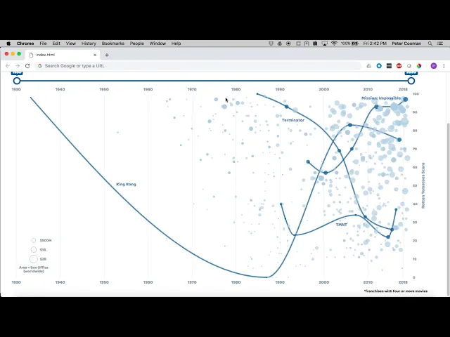
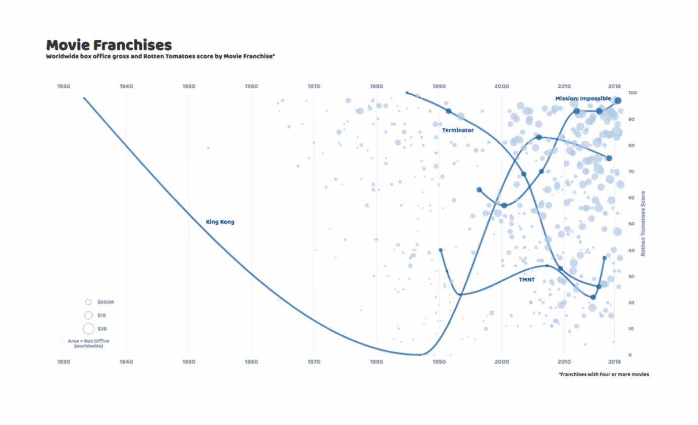
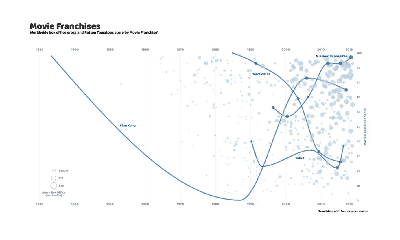
This chart shows all movies that were part of a movie franchise with at least four movies. Each movie is represented by a bubble, where the location of the bubble along the X axis indicates its release date, the Y axis indicates its Rotten Tomatoes score, and the bubble size is proportional to the movie’s worldwide box office gross.
This helps us identify:
- Franchises that got better (or worse) over time
- Franchises that make all the money despite low review scores
- Franchises that perhaps deserve another look
The inspiration for this work comes from The Economist’s excellent visualization of TV shows (“TV’s golden age is real”, published November 24th, 2018). To give it my own twist, I combined data on the most popular franchises from By the Numbers with movie ratings data from OMDb. For convenience, we’ve made the combined data set available in the GitHub repo.
In Part I, we covered the basics of HTML, CSS and D3, and created a reusable template that integrates with R in a way that allows you to easily inject your own data into a D3 visualization.
By the end of Part II, we will have a static version of the visualization shown above (we’ll add interactivity in Part III):
Now that we know what we’re building towards, let’s check where we left off at the end of Part I…

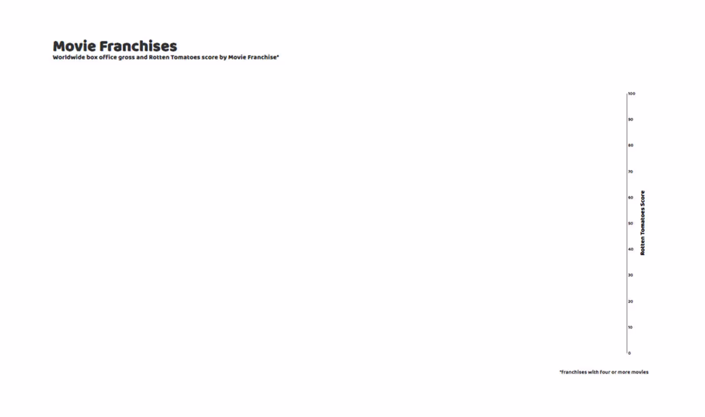
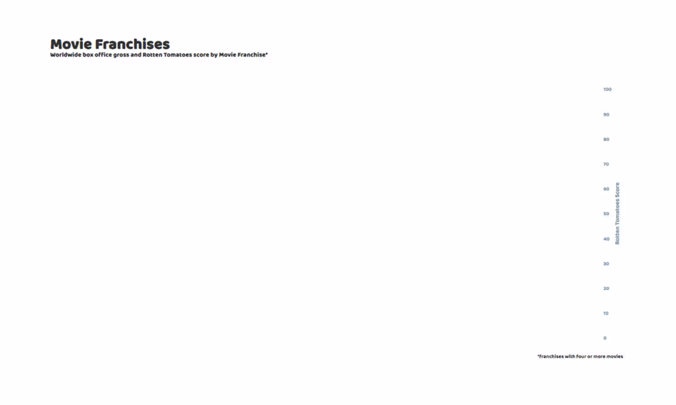
Yikes — that’s a lot of white space! Clearly, we still have a long way to go. Don’t be fooled by all of that white space though, we’ve already laid much of the groundwork: we have a title, subtitle and caption in place, all with custom styling, and we’ve set up our drawing canvas with custom dimensions and margins. A great starting point for any data viz!
1. Titles
Before we start drawing, let’s update our titles to better reflect what the chart will show.
<BODY>
<DIV ID='TITLE' STYLE='WIDTH:1366PX;'>
      <H1>MOVIE FRANCHISES</H1>
      <H2>WORLDWIDE BOX OFFICE GROSS AND ROTTEN TOMATOES SCORE BY MOVIE FRANCHISE*</H2>
      <BR></BR>
   </DIV>
   <DIV ID='VIS' STYLE='WIDTH:1366PX;'>
       <SVG CLASS='CHART-OUTER'><G CLASS='CHART'></G></SVG>
   </DIV>
   <DIV ID='CAPTION' STYLE='WIDTH:1366PX;'>
      <P STYLE='TEXT-ALIGN:RIGHT'>*FRANCHISES WITH FOUR OR MORE MOVIES</P>
   </DIV>
<SCRIPT>
There’s no new code here, we just updated the text. If you prefer a different font, you can easily change the formatting using CSS (see Part I for details). With this little bit of housekeeping out of the way, we can start the real work.
2. Scales
D3 scales allow us to map data values to visual dimensions, like the horizontal or vertical position, or color hue. In our movie franchises visualization, we represent each movie by a bubble. The visual attributes of each bubble encode properties (data) of the movie it represents:
- The bubble’s horizontal position represents the movie’s release date. Movies with earlier release dates have bubbles closer to the left edge of the chart and those with later release dates are closer to the right edge.
- The bubble’s vertical position represents the movie’s Rotten Tomatoes score (0%-100%). The higher a movie’s score, the closer we want to draw the corresponding bubble to the upper edge of the chart.
- The bubble’s area represents the movie’s worldwide box office gross. The larger the box office, the larger the bubble.
This is what we mean when we “bind data” to graphical elements.
To define our three D3 scales, add the following code block to your draw() function within the <script> section:
      VAR SVG = D3.SELECT('.CHART').APPEND('SVG')
            .ATTR('WIDTH', VIS_WIDTH)
            .ATTR('HEIGHT', VIS_WIDTH)
          .APPEND('G')
            .ATTR('TRANSFORM', 'TRANSLATE(' + MARGIN.LEFT + ',' + MARGIN.TOP + ')');
      VAR XSCALE = D3.SCALETIME()
              .RANGE([0, WIDTH])
              .DOMAIN([NEW DATE('1930-01-01'),
                       NEW DATE('2020-01-01')])
      VAR YSCALE = D3.SCALELINEAR()
        .RANGE([HEIGHT, 0])
        .DOMAIN([0,
                 100]);
      VAR BUBBLESCALE = D3.SCALELINEAR()
          .RANGE([10,500])
          .DOMAIN([_.MIN(DATA.MAP(FUNCTION(D) { RETURN D['GROSS'];})),
                   _.MAX(DATA.MAP(FUNCTION(D) { RETURN D['GROSS'];}))]);
Each scale has a domain and a range. The domain is the set of values that we are mapping from (data values), while the range is the set of values that we are mapping to (graphical attributes). Since all of our dimensions are continuous, we only need two-element vectors to describe our domains and ranges: minimum and maximum values.
The first scale, called xScale, is a time scale, mapping release dates to horizontal positions. The date 1/1/1930 is mapped to 0, the left edge of the chart, while the date 1/1/2020 is mapped to width, the right edge of the chart. All the movies in our data set were released sometime between these dates, so they will be drawn somewhere in between.
The second scale, yScale, maps Rotten Tomatoes scores to vertical positions. Notice that the mapping seems to be reversed: we want to draw movies with lower scores at the bottom, but a 0 score is mapped to height. Please note- this is not a bug, it’s a fun D3 quirk! In D3, distance is measured from the top of the screen:
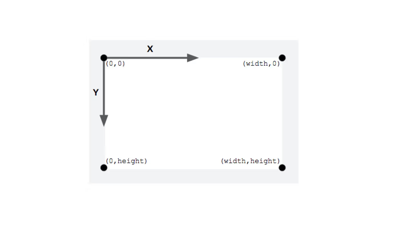
So, we need to map a 0 score to height (bottom of the screen) and a 100 score to 0 (top of the screen). Don’t worry if you ever mess this up, just flip the range values and you’re good to go!
For the third scale, bubbleScale, I extracted the minimum and maximum box office grosses straight from the data. The _.min() and _.max() respectively return the minimum and maximum values of an array. These functions are provided by the Underscore.js package, an extremely handy collection of helper functions for mathematical operations and data manipulation (you can find more details here). The ‘_.’ indicates an Underscore.js function, similar to how ‘d3.’ indicates a D3.js function. Inside the _.min() and _.max() functions, we convert the gross column in our data table into an array, with:
data.map(function(d) { return d['gross'];})The map() function cycles through the rows of the data table, and applies a function to each row d (similar to the apply() function in R). Here, we only want to subset the row element that corresponds to the box office gross column (gross). We can do this using either 1) d[‘<column name>‘] or 2) d.<column name>. The choice is yours. Option 2 looks cleaner (no quotation marks), but I personally prefer option 1, because we already use a lot of dots (for libraries and chaining operations) and I don’t want to get things confused. All of this may look a bit convoluted, but remember: we simply converted a data table column into an array. Get used to this function(d) {return d[‘<column name>‘];} operation. We will be using it a LOT!
3. Y Axis
We are now ready to draw our first element! We’ll start modestly, with the Y axis:
      VAR YAXIS = D3.AXISRIGHT(YSCALE)
                   .TICKSIZE(0);
      SVG.APPEND('G')
          .ATTR('CLASS', 'Y AXIS')
          .ATTR('TRANSFORM', 'TRANSLATE(' + WIDTH + ',' + 0 + ')')
          .CALL(YAXIS);
The first lines of code represent an axis generator. By itself, it doesn’t actually draw anything on your canvas, it just links an axis to a scale, in our case to the yScale we defined earlier. The “Right” in d3.axisRight() does not mean that the axis will be drawn on the right of the screen, but that the tick marks and tick labels will appear to the right of the axis line. The other axis generators, d3.axisTop(), d3.axisBottom() and d3.axisLeft() work the same way. For this visualization, I chose to remove the tick marks with tickSize (0), for a cleaner look.
With the second block, we actually add a Y axis to our chart, by calling the yAxis generator function. The term “generator” implies that we could add as many Y axes as we want, but we’ll just add the one. The block starts with svg, which we defined back in Part I and represents the plotting area: the area inside the margins. The benefit of appending new elements to svg, is that each new element will inherit svg’s translations. This is a very handy shortcut! Without it, we would need to translate each new element by the left and top margins.
Here, we append a ‘g’ element, which represents a group of elements. After all, an axis is really a grouping of a line, tick marks and tick labels. Next, we define the class attribute. Class labels help us select and manipulate all elements with the same label. You are free to choose how to label things, but it helps to pick intuitive labels (here: y and axis).
The next line translates the axis to the right edge of the plotting area. Because we appended the axis to svg, its origin coincides with the origin of svg: the top-left corner of the plotting area. The transformation, .attr(‘transform’, ‘translate(‘ + width + ‘,’ + 0 + ‘)’), moves the origin of the axis to the right, to the top-right corner of the plotting area.
Now, we call our generator yAxis and with it our yScale. We defined yScale’s domain as 0% → 100% (Rotten Tomatoes score), and mapped this to height → 0. But remember that height is actually the bottom edge of the plotting area, because of the way D3 treats the vertical position (see the chart above). That is how we get a Y axis that points from the bottom-right corner (0% Rotten Tomatoes score, maps to height) to the top-right corner (100% Rotten Tomatoes score maps to 0), even though its origin is technically in the top-right corner. Follow the steps if you’re not convinced!
You may have noticed that something is still missing from our Y axis: a title! We need to add this as a separate element:
         SVG.APPEND("TEXT")
            .ATTR("CLASS", "AXIS_TITLE")
            .ATTR("TEXT-ANCHOR", "MIDDLE")
            .ATTR("TRANSFORM", "TRANSLATE("+ (WIDTH + 40) + "," + (HEIGHT/2) + ") ROTATE(-90)")
            .TEXT("ROTTEN TOMATOES SCORE");
We again append to svg, but this time it’s a text element. The origin of a text element is located at the bottom-left corner of the text box. By appending to svg, the text element’s origin will coincide with svg’s origin. Setting the text-anchor attribute to middle, causes the text to be centered around the origin — which is still located at the origin of svg! From there, we move the text element to the right and down, and then rotate it 90 degrees counterclockwise around its origin. The order of these operations matters. It may take some trial and error to get your axis title in the right position. Notice also that we translated to the right by width + 40, meaning that our axis title actually falls outside the plotting area (but still within our right margin).
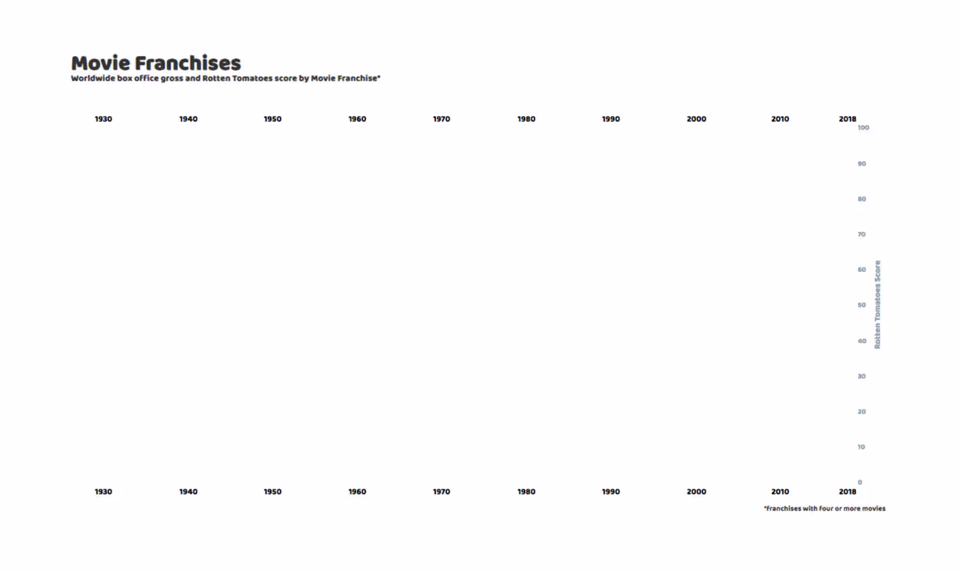
Your chart should now look like this:
We can improve the look of our Y axis by adding the following blocks to the CSS section:
   .AXIS TEXT {
     FILL: #8FA2AC;
     FONT: 12PX SANS-SERIF;
     FONT-FAMILY: BALOO THAMBI;
   }
   .AXIS_TITLE {
     FILL: #8FA2AC;
     TEXT-ANCHOR: MIDDLE;
     FONT-FAMILY: BALOO THAMBI;
   }
   .AXIS PATH,
   .AXIS LINE {
     FILL: NONE;
     STROKE: NONE;
     SHAPE-RENDERING: CRISPEDGES;
   }
Notice the class labels! The first two of these blocks change the fill color of the tick labels and the axis title, while the third block actually makes the axis line invisible:
Great work! Let’s move on to the X axis!
4. X Axis
We could use the same approach to draw the X axis (make an X axis generator, append an axis to the chart and then remove the line and the ticks), but I’ll show you a different way, so we can learn some new D3 tricks!
      VAR DATE_LABELS = [{DATE: '1930'},
                         {DATE: '1940'},
                         {DATE: '1950'},
                         {DATE: '1960'},
                         {DATE: '1970'},
                         {DATE: '1980'},
                         {DATE: '1990'},
                         {DATE: '2000'},
                         {DATE: '2010'},
                         {DATE: '2018'}];
      SVG.SELECTALL('.DATE_LABEL_TOP')
          .DATA(DATE_LABELS)
        .ENTER().APPEND('TEXT')
          .ATTR('CLASS', 'DATE_LABEL_TOP')
          .ATTR('X', FUNCTION(D) {RETURN XSCALE(NEW DATE(D['DATE'] + '-01-01'));})
          .ATTR('Y', YSCALE(100) – 10)
          .TEXT(FUNCTION(D) {RETURN D['DATE']})
We first define a table, called date_labels, with the year labels we want to display.
The next block is where the D3 magic happens! Again, we start by appending to svg. Next, selectAll(‘.date_label_top’) creates a D3 selection containing all elements in the DOM (Document Object Model) with class ‘date_label_top’. This probably seems odd, because we don’t have any elements with class ‘date_label_top’! That’s ok, it just means our selection is empty. We’ll add some elements to it soon. The second line, data(date_labels), joins data to our selection. We have more data elements than we have elements in our selection, so this join will return an update selection. Calling enter() on this update selection returns an enter selection which represents the elements that need to be added (one for each row in our data table). This is typically followed by an append().
Here, we append a text element for each row of our date_labels table. With attr(‘class’, ‘date_label_top’), we assign the ‘date_label_top’ class to each new text element. This means that, from now on, we’ll be able to select all these text labels with d3.selectAll(‘.date_label_top’), which then allows us to change its attributes or stylings. This will come in handy when we add interactivity! And of course, we can use this class label in our CSS section to change the stylings of all elements with class date_label_top. (just keep an eye on that dot ‘.’ because it is easy to miss!).
OK, back to our new text elements. Each text element has an x and y attribute, governing its horizontal and vertical location. We want all of our labels to have the same vertical position, so the y attribute is simply a constant: attr(‘y’, yScale(100) – 10). Remember that we set our yScale to map 100 to 0, so this will place our date labels at the top of the plotting area. I subtracted an additional 10px (- 10), to place the labels just above the plotting area, within the top margin.
The x attribute is a little more complicated, because we want different horizontal positions for each label, depending on the date values in our date_labels table. That’s where our old friend function(d) comes in. As we loop through our input table, creating a new text element for each row, d represents the active table row. To map the date to a horizontal position, we use xScale(new Date(d[‘date’] + ‘-01-01’)). Here, d[‘date’] subsets the date element (the only element) from our table row d. This returns a string, which we concatenate with + ‘-01-01’, turning the year string into a date string (e.g., ‘1930-01-01’), which we can then convert into an actual date object with Date() and finally into a horizontal position using xScale().
Finally, to set the actual text that the text element will display on the chart, we use the text() function. We can again use function(d) {return d[‘date’]} to assign the ‘date’ element of each row d as we loop through our date_labels table.
While we’re at it, let’s add a row of date labels to the bottom of the chart as well:
     SVG.SELECTALL('.DATE_LABEL_BOTTOM')
          .DATA(DATE_LABELS)
        .ENTER().APPEND('TEXT')
          .ATTR('CLASS', 'DATE_LABEL_BOTTOM')
          .ATTR('X', FUNCTION(D) {RETURN XSCALE(NEW DATE(D['DATE'] + '-01-01'));})
          .ATTR('Y', YSCALE(0) + 20)
          .TEXT(FUNCTION(D) {RETURN D['DATE']})
The only difference between these labels and the one before is the date_label_bottom class label, which allows us to style these differently if we wanted to (we won’t though).
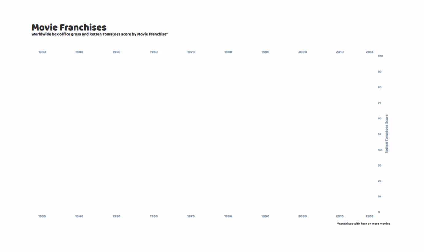
Your chart should now look like this:
Add the following blocks to you CSS section, to add some styling to your new date labels:
   .DATE_LABEL_TOP {
     FILL: #8FA2AC;
     TEXT-ANCHOR: MIDDLE;
     FONT-FAMILY: BALOO THAMBI;
   }
   .DATE_LABEL_BOTTOM {
     FILL: #8FA2AC;
     TEXT-ANCHOR: MIDDLE;
     FONT-FAMILY: BALOO THAMBI;
   }
Nothing here that you haven’t seen before!
We’re on the right track! The .selectAll () . data () . enter () . append () chain is fundamental to D3! If you understand the concepts behind it, you’re well on your way to mastering D3!
5. Date Markers
With this next block, we add some vertical grid lines:
        .DATA(DATE_LABELS)
        .ENTER().APPEND('LINE')
          .ATTR('CLASS', 'DATE_MARKER')
          .ATTR('Y1', YSCALE(0))
          .ATTR('X1', FUNCTION(D) {RETURN XSCALE(NEW DATE(D['DATE'] + '-01-01'));})
          .ATTR('X2', FUNCTION(D) {RETURN XSCALE(NEW DATE(D['DATE'] + '-01-01'));})
          .ATTR('Y2', YSCALE(100))
          .STYLE('STROKE', '#E3E9ED')
All of this should look familiar now. This is the same selectAll () . data () . enter () . append () chain that we used to draw the top and bottom date labels, except this time we append a line element for each element in the date_labels table. Each line element is defined by the (x,y) coordinates of its origin and terminal points. Vertically, we want each line to run from the bottom to the top, so we set y1 to yScale(0) and y2 to yScale(100). Horizontally, we want each line to sign with the top and bottom date labels, so we again use the xScale with function(d) {return xScale(new Date(d[‘date’] + ‘-01-01’));} to map each year in the date_labels table to its horizontal position on the chart.
Note that we also used a style() function to set the stroke (color) of each line to #E3E9ED (light blue). We could just as well have used the CSS section for this. It’s really up to you. Speaking of CSS, let’s add the next block to the CSS section:
.DATE_MARKER {
     STROKE-WIDTH: 1PX;
}
This sets the stroke-width (line thickness) to 1px. Again, we could have specified this when we created the line elements, with .style(stroke-width, 1) or .style(stroke-width, ‘1px’). It’s up to you.

6. Curves
Now we need to draw the curves that connect the bubbles for movies that belong to the same franchise, before we draw the bubbles themselves. The reason is that later, in Part III, we will add a tooltip pop-up that appears whenever we hover over a bubble.
For this to work properly, we need the bubbles to lie on top of the curves, otherwise the lines will cover up the bubbles and D3 will think we’re hovering over the curve instead of over the bubble, and the tooltip will not appear.
We want to connect our bubbles with smooth curves. We can’t simply add a bunch of line elements, because those are simple straight lines with a single start and end point. Instead, we’ll be using path elements. We start by defining a d3.line() generator function:
      VAR LINE = D3.LINE()
          .X(FUNCTION(D) { RETURN XSCALE(NEW DATE(D['DATE'])); })
          .Y(FUNCTION(D) { RETURN YSCALE(D['RATING']); })
          .CURVE(D3.CURVEMONOTONEX)
We set the X coordinates of each curve to be scaled versions of the release dates, and the Y coordinates to be scaled versions of the Rotten Tomatoes scores. By default, this will create a piecewise linear path, so we add smoothing with curve(d3.curveMonotoneX). Here, curveMonotoneX means that the X coordinates should increase monotically (we don’t want the smoothed curve to go backwards).
We want to draw a curve for each franchise, so I set up a for-loop that filters our original data table to keep only the rows for a single franchise and then adds a curve to the chart. I’ll show the for-loop first, and then we’ll add the drawing later:
      VAR FRANCHISES = D3.SET(DATA.MAP(FUNCTION(D) { RETURN D['FRANCHISE'];})).VALUES();
      VAR I;
      FOR (I = 0; I < FRANCHISES.LENGTH; I++) {
          VAR FRANCHISE_FILT = FRANCHISES[I];
          VAR DATA_FILT = _.FILTER(DATA,FUNCTION(ELEMENT){
              RETURN ELEMENT.FRANCHISE && [ELEMENT.FRANCHISE].INDEXOF(FRANCHISE_FILT) != -1;})
      };
The first line extracts all unique values from the franchise column. We then define an index i, and set our loop to run from 0 to the number of franchises. Franchise_filt is the franchise we want to filter on, and data_filt are all rows in the data table for the franchise we’re interested in. We can now draw our curve using the following block of code (this goes inside the for-loop):
          SVG.APPEND('PATH')
              .DATUM(DATA_FILT)
              .ATTR('CLASS', FUNCTION(D) {RETURN D[0]['HIGHLIGHT'] == 1 ? 'CURVE LINE_' + I + ' LINE_HIGHLIGHT': 'CURVE LINE_' + I;})
              .ATTR('D', LINE)
              .STYLE('FILL', 'NONE')
              .STYLE('STROKE','#005B96′)
              .STYLE('STROKE-WIDTH', 4)
              .STYLE('OPACITY', FUNCTION(D) {RETURN D[0]['HIGHLIGHT'] == 1 ? 0.7 : 0;})
This chain may look familiar, but there are some important differences!
First, we’re calling datum() instead of data(). We use data() when we want to create an element for each row of a table, but here we want to bind all data rows together into a single object (a single curve to connect all movies within a single franchise), so we need to use datum() instead.
Second, we don’t need to call enter().
Third, we use an if-else statement to set the opacity of the curve. In JS, an if-else statement takes the form <conditional statement> ? <if condition is true> : <if condition is false>. Here, we want to set the opacity of the curve to 0.7 if the curve should be highlighted (displayed) and to 0 for all other curves, effectively making them invisible.
Whether or not a curve should be highlighted is indicated by a 1 flag in the highlight column of the data_filt table. Since this value will be the same for all movies of the same franchise, we only need to check the first row d[0]. Here ‘d’ represents the entire table, not just a single row, so we need the d[0] to select the first row. We can then subset the highlight column value using d[0][‘highlight’]. We use this same trick to assign a second class label ‘line_highlight’ to all curves we want to highlight. This will come in handy later, in Part III.
Finally, we use attr(‘d’, line) to call the curve generator function. This passes the table data_filt, represented by ‘d‘, into the line() generator function we defined earlier.
7. Bubbles
With our curves in all the right places, we can now add our bubbles! Instead of drawing the bubbles in the same for-loop we used to draw the curves, we’ll want to use a new for-loop, to ensure that all of the bubbles lie on top of all of the curves. Each iteration of this for-loop draws a separate set of bubbles — all movies that belong to the same franchise:
FOR (I = 0; I < FRANCHISES.LENGTH; I++) {
VAR FRANCHISE_FILT = FRANCHISES[I];
VAR DATA_FILT = _.FILTER(DATA,FUNCTION(ELEMENT){
RETURN ELEMENT.FRANCHISE && [ELEMENT.FRANCHISE].INDEXOF(FRANCHISE_FILT) != -1;})
SVG.SELECTALL('.CIRCLE_' + I)
.DATA(DATA_FILT)
.ENTER().APPEND('CIRCLE')
.ATTR('CLASS', FUNCTION(D) {RETURN D['HIGHLIGHT'] == 1 ? 'DOT CIRCLE_' + I + ' CIRCLE_HIGHLIGHT' : 'DOT CIRCLE_' + I;})
.ATTR('CX', FUNCTION(D) { RETURN XSCALE(NEW DATE(D['DATE']));})
.ATTR('CY', FUNCTION(D) { RETURN YSCALE(PARSEFLOAT(D['RATING']));})
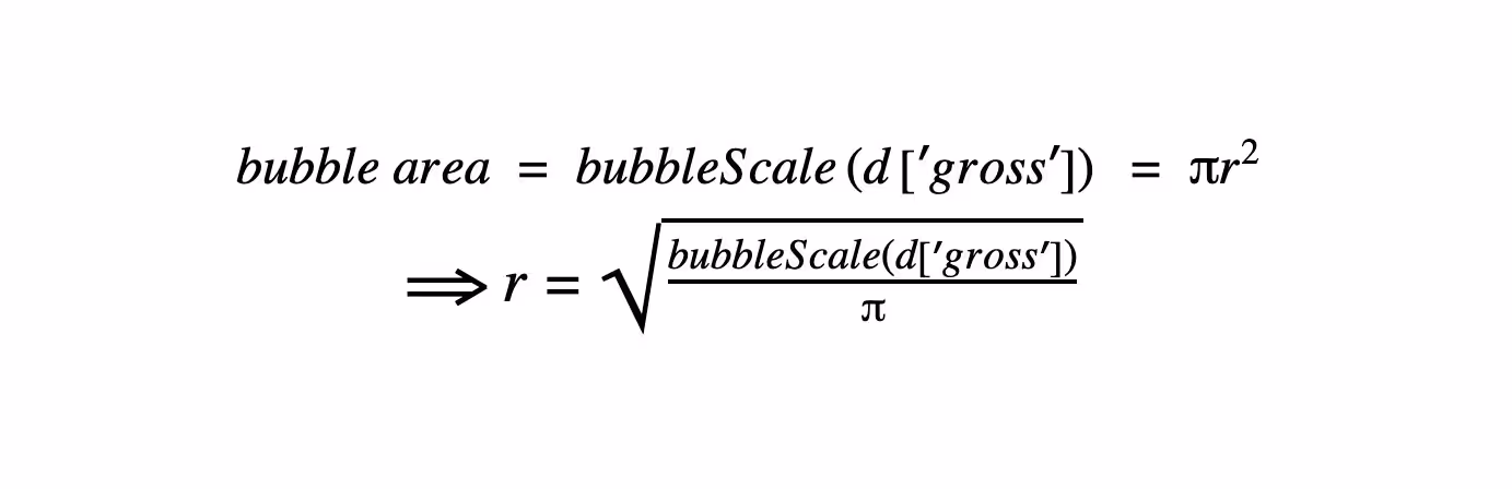
.ATTR('R', FUNCTION(D) { RETURN MATH.SQRT((BUBBLESCALE(PARSEFLOAT(D['GROSS'])))/MATH.PI);})
.STYLE('FILL', FUNCTION(D) {RETURN D['HIGHLIGHT'] == 1 ? '#005B96' : '#B3CDE0';})
.STYLE('STROKE-WIDTH', 0)
.STYLE('STROKE', 'BLACK')
.STYLE('OPACITY', 0.7)
};The main difference between this block of code and the one we used for the curves (besides some styling choices) is that we’re back to using our old friend the .selectAll () .data () .enter () .append () chain. When we wanted to draw a single curve through multiple points, we used .append () .datum (), but now we want to draw a new bubble for each movie in our filtered data set (single movie franchise), so we need to use .selectAll () .data () .enter () to create an enter selection representing the elements that need to be added (one bubble for each movie in the filtered data set).
The second notable difference is the use of the ‘circle‘ element. The attributes that define a ‘circle‘ element are the X and Y coordinates of its center (cx and cy, respectively) and its radius r. We can use xScale() to map the movie’s release date to cx, and yScale() to map its Rotten Tomatoes score to cy. Nothing new there. However, we do need to be careful with mapping box office gross to r. The bubbleScale() scaling function is a proportional mapping from box office gross to bubble size. If we want to maintain this proportional mapping, we need to solve for r:
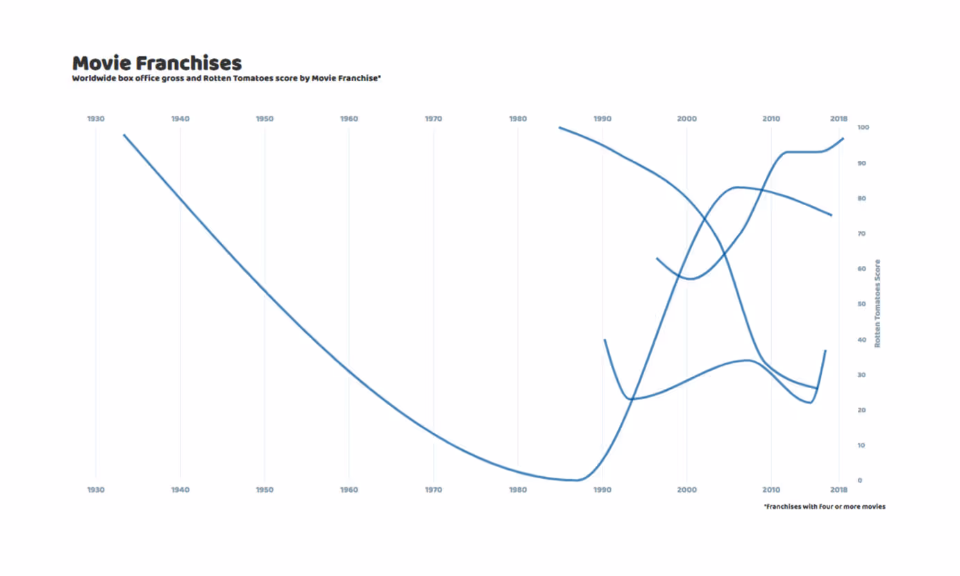
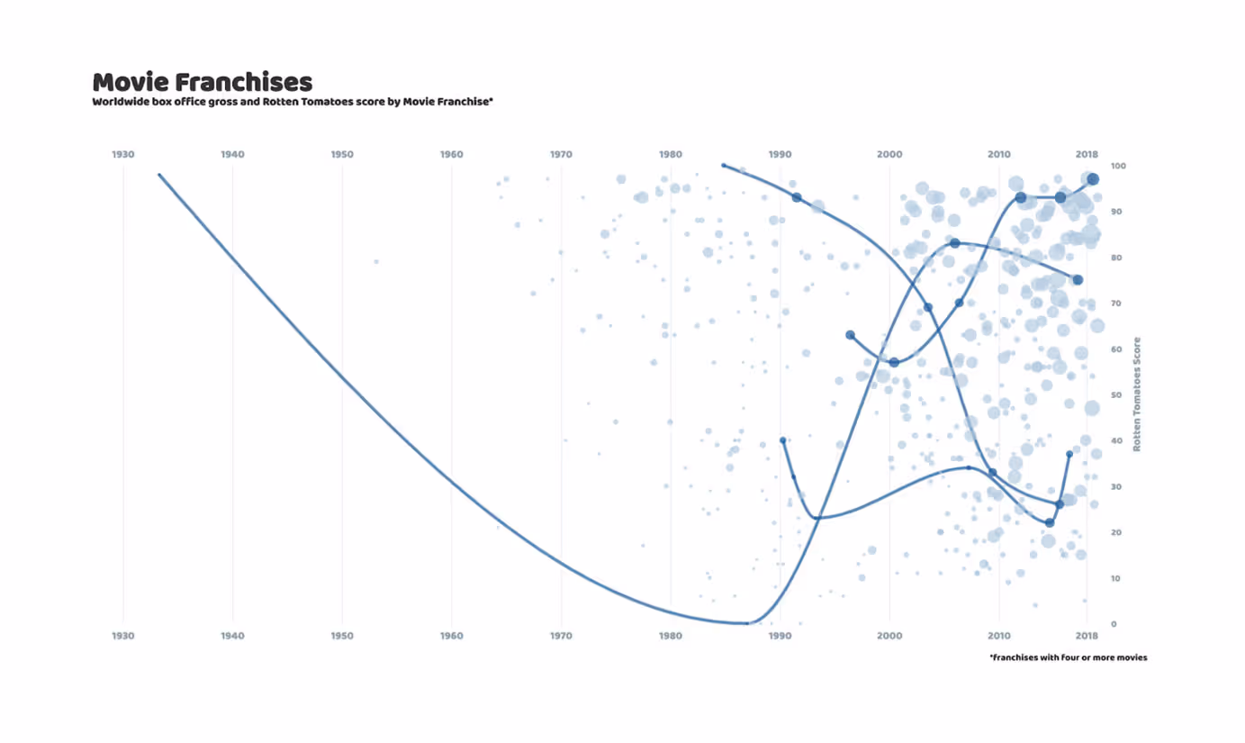
If you’re still following along, your chart should now look like this:
8. Finishing Touches
I still want to add a couple of things to our visualization, but from here on out, everything we’ll be using will be techniques we’ve used and explained in previous sections. So congratulations, you’ve made it!!!
For our finishing touches, we’ll add some labels for the franchises we chose to highlight (the ones with visible curves), and we’ll need to add a legend for the bubble size, so our readers can correctly interpret our visualization.
We’ll start with the franchise labels:
      VAR SHOW_LABELS = [{FRANCHISE: 'KING KONG', DATE: '1955-01-01', RATING: 50},
                         {FRANCHISE: 'TERMINATOR', DATE: '1993-01-01', RATING: 85},
                         {FRANCHISE: 'TMNT', DATE: '2004-01-01', RATING: 28},
                         {FRANCHISE: 'MISSION: IMPOSSIBLE', DATE: '2013-01-01', RATING: 97}];
      SVG.SELECTALL('.SHOW_LABEL')
          .DATA(SHOW_LABELS)
        .ENTER().APPEND('TEXT')
          .ATTR('CLASS', 'SHOW_LABEL')
          .ATTR('X', FUNCTION(D) {RETURN XSCALE(NEW DATE(D['DATE']));})
          .ATTR('Y', FUNCTION(D) {RETURN YSCALE(D['RATING']);})
          .STYLE('FILL', '#005B96')
          .STYLE('FONT-SIZE','14PX')
          .STYLE('TEXT-ANCHOR','MIDDLE')
          .STYLE('OPACITY', 1)
          .TEXT(FUNCTION(D) {RETURN D['FRANCHISE']})
The code for the bubble size legend is more involved, simply because there are more elements we need to piece together (i.e. circles, legend labels and the title of the legend itself), but again, it’s nothing we haven’t seen before:
      VAR DATA_LEGEND = [{GROSS: 2000000000, TEXT: '$2B'},
                         {GROSS: 1000000000, TEXT: '$1B'},
                         {GROSS:  500000000, TEXT: '$500M'}];
      SVG.SELECTALL('.CIRCLE_LABEL')
          .DATA(DATA_LEGEND)
        .ENTER().APPEND('CIRCLE')
          .ATTR('CLASS', 'CIRCLE_LEGEND')
          .ATTR('CX', FUNCTION(D) {RETURN XSCALE(NEW DATE(PARAMS['MIN_DATE'] + '-06-01')) + 50;})
          .ATTR('CY', FUNCTION(D, I) {RETURN YSCALE(10) – 30*I;})
          .ATTR('R', FUNCTION(D) {RETURN MATH.SQRT((BUBBLESCALE(D['GROSS']))/MATH.PI)})
          .STYLE('STROKE-SIZE', 2)
          .STYLE('STROKE','#8FA2AC')
      SVG.SELECTALL('.CIRCLE_TEXT')
          .DATA(DATA_LEGEND)
        .ENTER().APPEND('TEXT')
          .ATTR('CLASS', 'CIRCLE_TEXT')
          .ATTR('X', FUNCTION(D) {RETURN XSCALE(NEW DATE(PARAMS['MIN_DATE'] + '-06-01')) + 70;})
          .ATTR('Y', FUNCTION(D,I) {RETURN YSCALE(10) – 30*I + 4;})
          .STYLE('FONT-SIZE','12PX')
          .TEXT(FUNCTION(D) {RETURN D['TEXT'];})
      LEGEND_LABEL_DATA = [{TEXT: 'AREA = BOX OFFICE'},
                           {TEXT: '(WORLDWIDE)'}]
      SVG.SELECTALL('.LEGEND_LABEL'
          .DATA(LEGEND_LABEL_DATA)
        .ENTER().APPEND('TEXT')
          .ATTR('CLASS', 'LEGEND_LABEL')
          .ATTR('X', FUNCTION(D) { RETURN XSCALE(NEW DATE(PARAMS['MIN_DATE'] + '-06-01')) + 50;})
          .ATTR('Y', FUNCTION(D,I) { RETURN YSCALE(5) + MATH.SQRT((BUBBLESCALE(50))/MATH.PI) + I*12;})
          .STYLE('FONT-SIZE','12PX')
          .STYLE('TEXT-ANCHOR','MIDDLE')
          .TEXT(FUNCTION(D) { RETURN D['TEXT']})
Finally, add some custom styling to the franchise labels and the bubble size legend, by copying the following block into the CSS section:
   .SHOW_LABEL {
     FONT-FAMILY: BALOO THAMBI;
   }
   .CIRCLE_LEGEND {
     FILL: NONE;
   }
   .CIRCLE_TEXT {
     FILL: #8FA2AC;
     FONT-FAMILY: BALOO THAMBI;
   }
   .LEGEND_LABEL {
     FILL: #8FA2AC;
     TEXT-ANCHOR: MIDDLE;
     FONT-FAMILY: BALOO THAMBI;
   }
9. Next Steps
We’ve covered a lot of ground today, and I hope that this step-by-step breakdown of a single data viz has given you a deeper understanding (and appreciation) of the basics of D3, and that you now feel more comfortable using this amazing tool to build your own visualizations!
I hope to see you again for Part III, where we will delve into what sets D3 apart from other data visualization tools: interactivity! I’ll show you how you can add tooltip pop-ups, a dropdown menu to select the franchise you want to highlight, a slider UI that lets you control the date range they want to display, and more. Til next time!